
25.05.2021
These are the most important innovations that are available in the May 2021 update of KIWI HEALTH. You can get a complete overview of all the new features in this post.
All innovations at a glance
First of all, a list of all the innovations in the various program areas of KIWI HEALTH. Some of them will be described in more detail in the course of this article.
General:
- Marking of health values as “favorite”, these are then displayed in the dashboard, in the evaluation of the health data and in the comparison “alphabetically ordered on top”
- Sorting of health values by device, alphabetically or by category
- Updated translations
Health data:
- Selection and display of a freely definable comparison period
- Synchronization of the selected rider when switching to another health value
- Improved display of current values and chart menu
- Display of the minimum, average and maximum values for the most recent week, month and entire time period.
- Option to display the labels in the diagram
- If required, then a title is displayed in the legend of the diagrams
- Color coding of the diagrams for noise level measurements
- Optimization of the evaluations for hand washing (calculation of the duration of hand washing).
Measurement statistics:
- Display of percentage distribution of measurement statistics (over hours in day, time of day and day of week) in pie charts
- Labels in the diagram for the measurement statistics are always displayed
PDF reports:
- Output of the minimum, average and maximum values for different time periods for better comparison in a table above the diagram
- PDF export of measurement statistics on a separate page
- Individual pages that are not needed can be deleted
User settings:
- Setting the default sorting of health values in the user settings.
- Query when closing the form whether the user settings should be saved if a change has been made
Favorites
If you have health values that you want to put a special focus on, then you can mark these values as “favorite”.
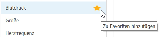
All favorites are then listed at the top and in alphabetical order in the “Dashboard”, “Health Values” and “Compare” pages in the navigation menu. In addition, the source is also displayed for the corresponding entry.
To mark a value as a favorite, simply move the mouse over the desired entry and click on the star that appears. The entry will then be removed from the current position and initially added to the group of favorites at the bottom. The next time the page is loaded or after a new program start, the favorites will then be displayed alphabetically. Removing an entry from the favorites is done analogously by clicking on the star.
Comparison period
Suppose your weight or any other health value is subject to major fluctuations. And you want to examine and evaluate the development in detail. You can view the history of this value at any time with KIWI HEALTH, Apple Health or other apps.
But what if, for analysis purposes, you want to compare a certain time period simultaneously with any other time period, and that too displayed in the same chart?
No problem, this feature has been implemented in the latest update of KIWI HEALTH. Great importance was attached to the greatest possible flexibility and user-friendliness. The comparison period can be freely selected by means of the “from-to” date and can be completely different from the period already selected. This means that you can, for example, display the course of a month and the course of a year simultaneously in one diagram. This evaluation option is available for all health data. All functions of the diagram, such as zooming and scrolling, are still available. And it goes without saying that this evaluation can be exported as a PDF report or image via the clipboard.
The PDF report on this image shows you what this can look like:
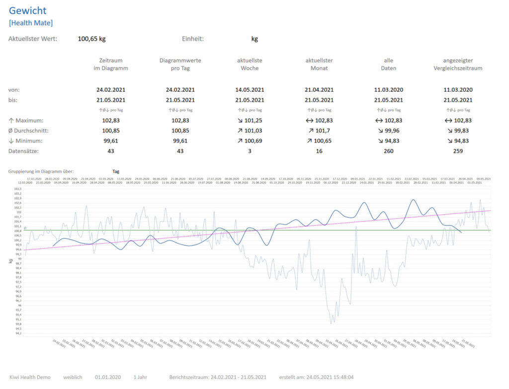
The dark blue line shows the trend over the last three months. The light blue line shows the course over a much longer period, here over almost 15 months. The progressions of both curves state that over the longer period of time, there was first a loss of weight, but then an increase again. The current trend is still upward, as can be easily seen from the dark blue curve. This can mean, for example, that any diet is obviously just not crowned with success and should be counteracted accordingly to achieve the desired goal.
Yet another example of an extremely useful application:
Maybe you suffer from high blood pressure and are dependent on medication. In some circumstances, these are always reset. With KIWI HEALTH you can now easily chart the time periods of two different medications and evaluate their effect and success. This evaluation is also particularly useful for the subsequent visit to the doctor.
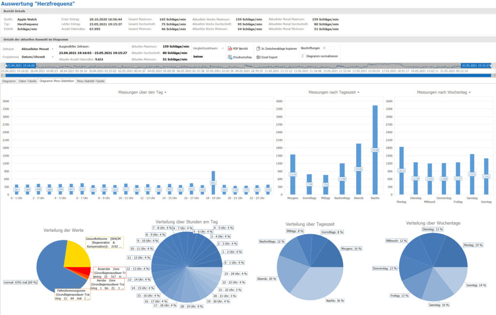
Measurement statistics
The percentage distribution of the measurements of your health values over the hours in the day, the time of day and the days of the week are now additionally displayed in three pie charts. This makes the evaluation of the measurement statistics even more meaningful, because you can now see at which times or on which days your measurement values per health value are predominantly recorded.
Improved PDF reports
The summary in the PDF report above the chart has been completely revised. You will now get the minimum, average and maximum values calculated and displayed for the data shown in the diagram and additionally for further time periods, including a freely selectable comparison period. And if you have the chart data summed up e.g. over calendar weeks, months etc., then these values are calculated down to the standard grouping of the respective health value.
The measurement statistics are now output on a separate PDF page. If you don’t need certain pages, you can easily remove them from the PDF preview menu before saving or printing the report.
Sorting the health values
The previous sorting of health values in the navigation menu and dashboard is only by the recording device or app. But that was too little for us!
You can now choose between three possible sorts and also switch between them at any time:
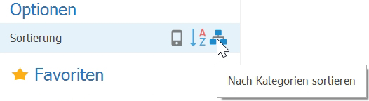
- by device (as before, this is also the default setting)
- alphabetical
- by category (as you know it from Apple Health)
In your user settings, you can set the setting that suits you as default.
Outlook
Unfortunately, there was not enough time for the announced evaluation “sleep analysis” for this update of KIWI HEALTH.
Planning and implementation have already begun, and this feature is now scheduled for the next update.
In addition, we will devote ourselves to the topic of “nutrition”. Here, too, there are already some very good ideas. This extension is planned for the next but one update of KIWI HEALTH.
User requests for new functions are still very welcome. Suggestions can be made at any time via a support ticket or by email to .