
14.03.2026
Evaluating health data means more than just looking at individual figures. The most valuable insights often appear only when two values are viewed in relation to each other.
With a new function in KIWI HEALTH, you can now display an additional health value directly in the chart – and analyze your health data more effectively.
Compare health data: What initially seems like a small extension opens up completely new possibilities in practice.
Why looking at a single value is often not enough
You may have experienced this yourself.
You look at your resting heart rate and notice that it was elevated in certain weeks.
Or your weight changes over several months.
But what was the cause?
Was it less sleep?
More intense training?
Changes in calorie intake or energy expenditure?
Health data becomes truly meaningful when relationships between values become visible. This is exactly where the new comparison feature comes in.
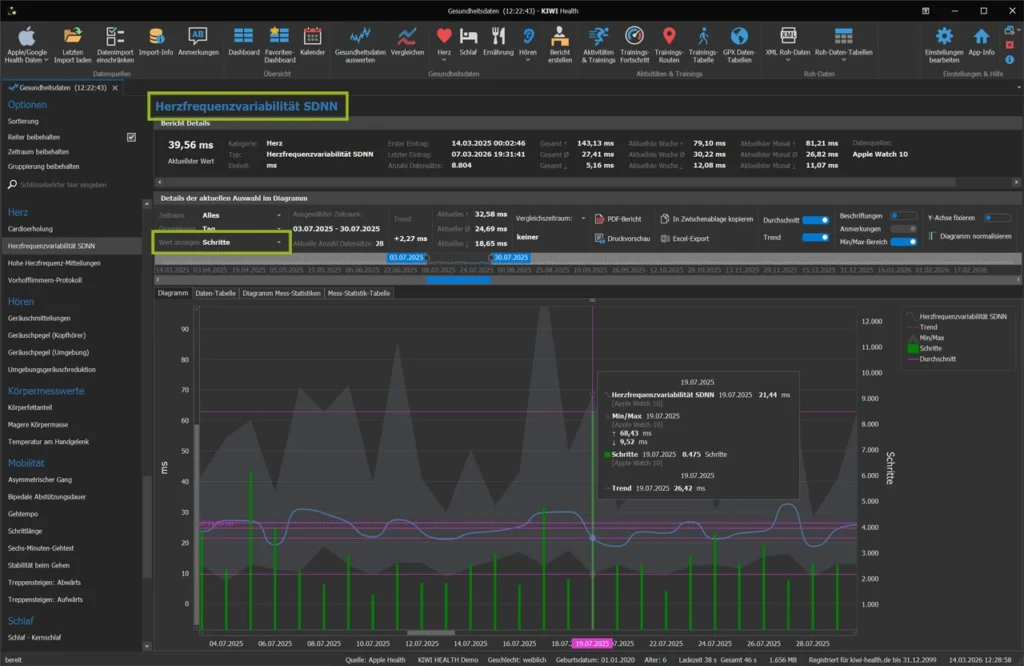
Display two health values in one diagram
With the latest update of KIWI HEALTH, you can also display a freely selectable second value in the diagram when evaluating your health data (you can find out what else diagrams in KIWI HEALTH can do in the article The power of diagrams…).
The selection is made very simply via a dropdown menu. The selected health value is added immediately – without existing settings being lost.
The following applies:
- Both values are displayed on the same time axis.
- Each value has its own Y-axis.
- Each value retains its defined series type (e.g. line, points or bar).
- The selected time aggregation applies equally to both values.
This means, for example:
If your body weight is displayed as a line and your steps as a bar, these display forms are retained – even if both values are displayed at the same time.
Flexible time aggregation – from raw data to long-term trends
As usual, you can switch between different time groupings:
- Date/Time
- Day
- Calendar week
- Month
- Quarter
- Year
The selected aggregation is applied to both values automatically. This allows you to analyze short-term details just as easily as long-term trends.
Even with large amounts of data – such as continuously recorded heart rate values – the display remains performant and responsive. During development, we deliberately ensured that the analysis works smoothly even with large data sets.
Methodically correct: Two Y-axes
One important aspect when analyzing multiple health values is scaling.
Body Weight is measured in kilograms, step counts in numbers, and heart rate in beats per minute. If both values were forced onto the same scale, visual distortions would occur.
This is why each health value in the diagram has its own Y-axis. This means that the orders of magnitude are correct and the representation remains meaningful.
This clean separation ensures that you can really analyze your health data – instead of just seeing it side by side.
Practical examples for analyzing health data
With this new feature you can explore questions such as:
Do body weight and calorie consumption develop in parallel?
Does your resting heart rate change during periods of short sleep?
Is there a relationship between HRV and training intensity?
Do your active minutes increase the more steps you take?
Do blood glucose values show abnormalities in connection with certain eating habits?
Such comparisons help you to recognize patterns and verify assumptions.
You may notice that changes in weight follow changes in calorie balance with a certain delay. Or that your resting heart rate rises measurably after weeks of intensive training.
Visualizing both values in the same chart makes these relationships much easier to recognize.
The PDF report reflects exactly what you see
Another advantage:
The PDF report shows the diagram exactly as it is displayed on the screen.
This includes:
- Notes on data points
- Labeling
- Zoom level
- Scroll position
- both Y-axes
- Selected time aggregation
This allows you to document, archive or pass on your analysis – without the display changing. This reproducibility is a decisive advantage, especially if you want to evaluate your health data over the long term or discuss it with medical professionals.
From visualization to analysis
With this enhancement, KIWI HEALTH takes a further step towards structured health analysis. Instead of looking at individual values in isolation, you can now compare specific health values, visualize correlations and better understand developments.
The combination of freely selectable time aggregation, independent Y-axes, different series types, high-performance display and complete PDF export turns a diagram into a real analysis tool.
Conclusion
Collecting health data is now easier than ever – whether through Apple Health or Google Health Connect.
However, the real added value only arises through targeted evaluation. Only when you compare values with each other do patterns become visible and developments comprehensible.
With the new comparison feature in KIWI HEALTH, you can analyze two health values within a single chart and directly compare their development over time. This gives you a clearer picture of your personal relationships – and allows you to classify changes more consciously.
Because in the end, it’s not about individual numbers.
It’s about understanding your health better – step by step and based on your own data.
If you would like to try out this new option for yourself, you can test KIWI HEALTH in the free demo version and compare your own health values directly with each other.