10.06.2022
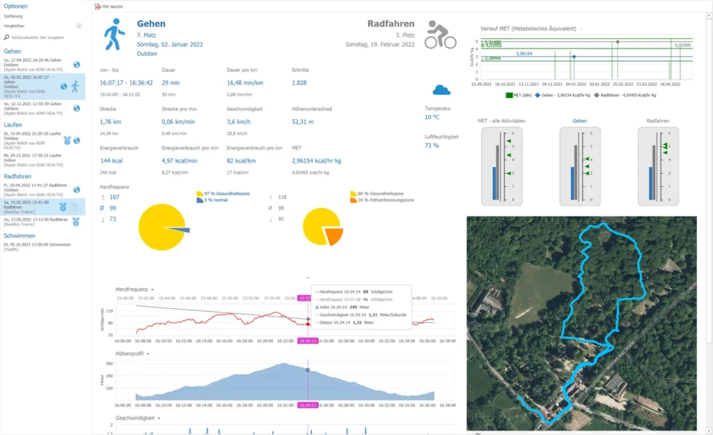
If you record your activities and workouts on your smartwatch or fitness tracker, and the analytics in apps or on websites aren’t enough for you, check out the new Activities and Workouts report page in KIWI HEALTH. In addition to the usual data and a map, you get a ranking based on MET (Metabolic Equivalent), you can directly compare the values of two workouts, monitor your progress and of course create a PDF report for evaluation with your trainer/coach.
Foreword
After all, sport is always a competition in some way. It doesn’t matter if you’re competing with your team against another team, going head-to-head with an opponent in a 1-on-1 match, or just trying to conquer your inner badass. In the end, the goal in sports is to increase performance or at least keep it at a high level.
But how do you find out if you reached your goals, if you trained well or not so well, what your daily form was and when exactly you ran out of breath? Here it depends on the detailed analysis of your data. It has also been difficult to date to track performance levels over time or to compare measured values.
More precisely, the direct comparison of two completely different activities is currently not possible by traditional means (apps and websites), because most of the time there is no value available or calculated that allows a comparison.
KIWI HEALTH uses the so-called “Metabolic Equivalent” (MET) for this purpose. The MET is calculated either from the turnover of oxygen in milliliters per kilogram of body weight per minute (which would be 3.5 ml for men and 3.15 ml for women) or from the energy consumption in kcal per kilogram of body weight per hour. Since very few people measure oxygen metabolic rate during exercise, in KIWI HEALTH MET is calculated using energy metabolic rate. This interpolates the weight per day from your existing weight measurements so that a calculation can be made for each day. Now you can “rank” your activities and workouts. It does not matter which sport it is, a comparison is possible at any time.
Of course, you also get all the other recorded data displayed in a clear form, which rounds off the evaluation of your activities and workouts. And with the printed PDF export, you can discuss your successes and progress with your trainer/coach.
How the report page works
Navigation bar
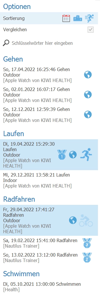
On the left side all activities and trainings are listed.
You can sort by the following criteria:
- Month/Year
- Ranking list
- Activity
To change the sort order, simply move the mouse over the menu item and click on the desired entry.
Compare:
If the check mark is set, then any two entries can be selected from the list. The first activity selected is the reference, the second entry is grayed out for comparison.
The icons next to the entries indicate which place the course occupies in the ranking (1st-3rd place), whether GPS data is available (globe) and whether the entry has been selected.
General values and comparison
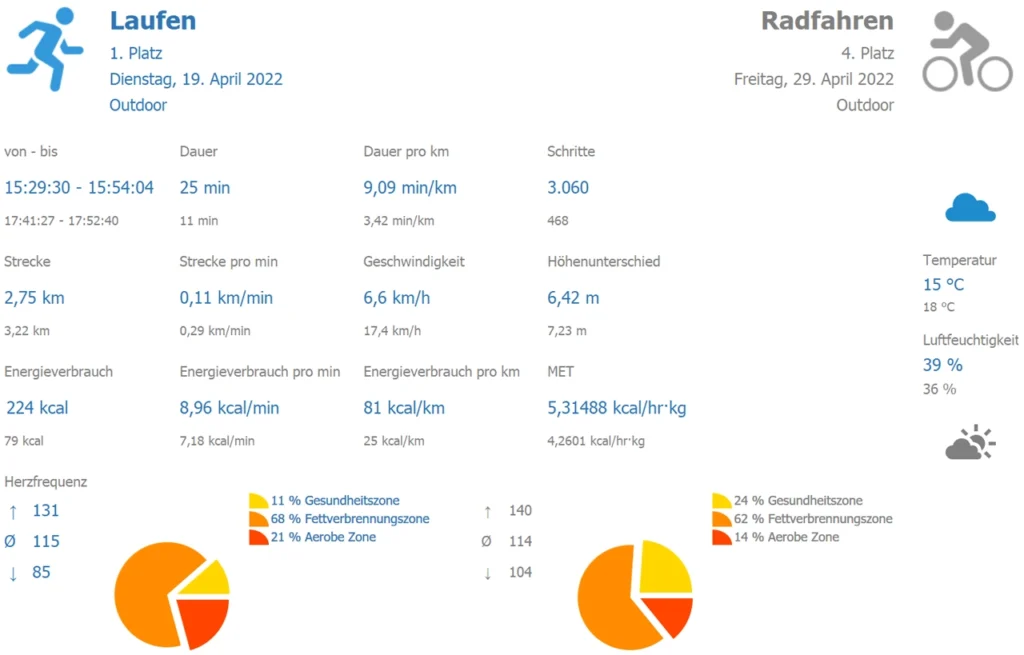
As soon as an item is selected in the navigation bar, the area for displaying the general values for this activity updates. The values of the first selected activity are displayed in blue, the values of the second activity are displayed in gray for comparison. For unavailable data, the corresponding space is simply left empty.
If the heart rate was measured, then in addition to the maximum, average and minimum values, the percentages of the heart rate in the various load ranges are displayed as a pie chart.
And if weather information is available, it will also be displayed on the report page. The sun and cloud symbols are determined by the temperature and humidity, but may differ from the actual weather.
Diagrams
Usually the following four diagrams are shown when GPX data is available:
- Heart rate
- Elevation profile
- Speed
- Distance
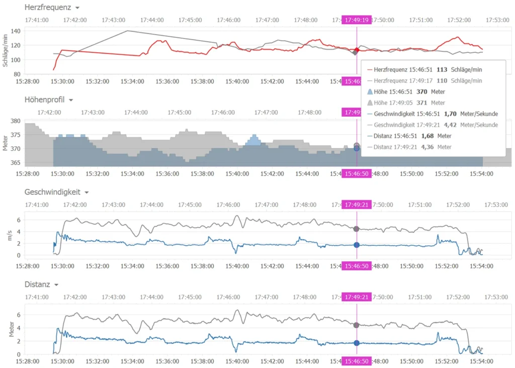
If no GPX data is available for an activity or for a workout, then the diagrams for the missing data are hidden.
You can scroll into the diagrams with the mouse wheel or select an area to be enlarged by holding down the Shift and left mouse buttons.
Course MET

This diagram shows the time course of all calculated MET for all activities as well as the maximum, average and minimum values. The selected training(s) are drawn as blue (and gray) line(s) with the MET value in the diagram.
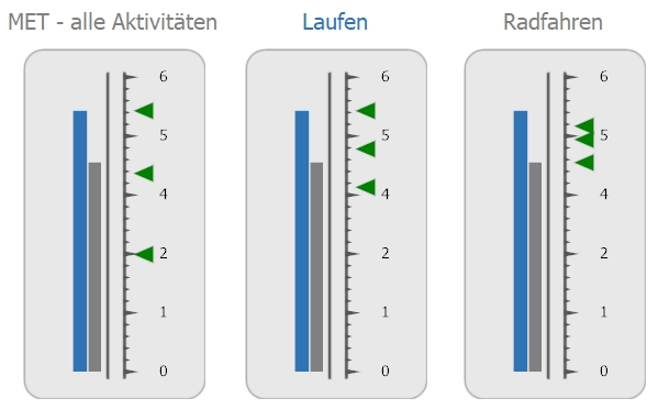
MET indicators
The MET indicators give you an overview of the MET performance of the selected activities in relation to “All activities” as well as the respective type of training. The vertical bars show the current performance, the green arrows indicate the maximum, average and minimum values. This way you can see at a glance how successful you have been compared to the other trainings and in which performance segment you have been (i.e. average, close to maximum, etc.).
Map
In the map (if available) the GPS data of both activities are drawn as a blue or light blue (gray would not always be well visible at this point) track. In the map you can scroll with the mouse wheel and move the position of the map with the left mouse button pressed.
Synchronize scroll position
If you open several windows at the same time and activate the “Synchronize scroll position” button, then scrolling in all windows can be done using only one scrollbar. This makes it easier for you to compare your workouts even if the active window is undocked from the application (i.e. not displayed in the main window). Just try how many windows can be opened on your display at the same time.
PDF report
This button generates a PDF and displays it in a preview window. You can save or print the PDF and remove individual pages you don’t need beforehand, as well as add comments.
Conclusion
For me, the evaluation options of the common apps and websites were simply not enough. With the direct comparison of two activities, the MET as a performance index and the possibility to sort and rate the workouts according to a ranking list, you get a much better overview of your activities and your training status. By evaluating this additional information, you can train more specifically and get more out of yourself.
A positive side effect: The evaluation is much more fun and makes the drops of sweat during sports somewhat forgotten!
Outlook
I still have some enhancements planned for this evaluation, which will be introduced gradually with the next updates.
These include:
- Simulation, which plays the track(s)
- Different map views
- Tooltip for the map synchronized with the diagrams
- Display of other health data recorded during training
And of course I am happy about all ideas and suggestions for improvement from the KIWI HEALTH users…
