01.07.2024
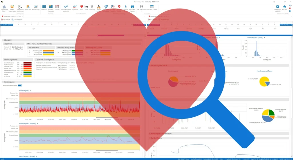
The latest update of KIWI HEALTH brings your heart into focus and provides you with a new report page on which all available heart data is clearly displayed.
This makes it easier to correlate the values and detect irregularities. The time period for selecting the data is freely selectable, and with the PDF report you can conveniently discuss the details with your doctor.
Introduction
Of course, it was already possible to evaluate your heart measurement data with KIWI HEALTH. Namely on individual report pages or, for example, during your training sessions.
What was missing, however, was an overview page on which all available values about your heart are summarized. This is the only way to quickly identify correlations or irregularities. This report is also very valuable for your doctor or cardiologist, as it provides them with all the relevant data in a single evaluation.
Furthermore, a new menu has been added in this update, which provides quick access to your heart evaluations. This means you no longer have to search for a long time if you want to focus on your heart values when evaluating.
The timeline
You can use the timeline to define the time period for displaying the data in the diagrams down to the second. All calculations and diagrams, with the exception of the measurement statistics, are updated immediately if the time period is changed.
Alternatively, the time period can also be selected using any diagram. All you need to do is select an area in the diagram while holding down the Shift key and left mouse button. All other diagrams are then also updated so that the same time period is displayed in each diagram.

The two points (1) can be used to flexibly set the period from – to. Use the slider (2) to set the zoom.
Section “Overview”
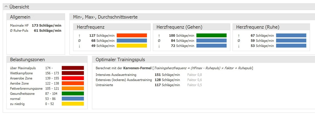
The overview is divided into the following areas:
- General
- Min, max, average values
- Heart stress zones
- Optimal training pulse
To be able to calculate the individual values correctly, you should enter your gender and date of birth in the settings in Apple Health. These two details are the basis for the calculations.
General
It is important for you to know what your maximum heart rate and average resting heart rate are. These two values are used to calculate the load zones and the optimum training heart rate.
Min, max, average values
These values give you an initial overview of your heart. These are calculated for the heart rate, heart rate (walking) and heart rate (resting) in the selected period.
Heart stress zones
The load zones or heart rate zones are individual and are based on percentages of the maximum heart rate. Age and gender play a role here.
Optimal training pulse
There are various approaches to determining the optimum training heart rate. In KIWI HEALTH, the calculation is carried out according to the Karvonen formula, which is also used in sports medicine to determine the appropriate heart rate for various forms of endurance training depending on the training status. The values therefore help you to plan and carry out your training and activities.
Section “Heart Rate”
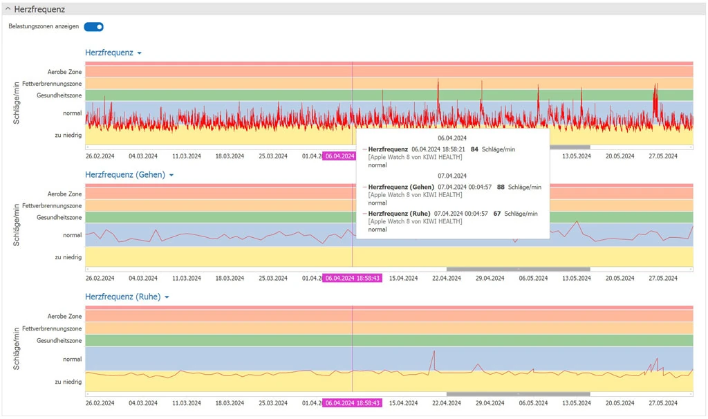
Displayed values:
- Heart rate
- Heart rate (walking)
- Heart rate (resting)
This shows the progression of the heart rate as well as the heart rate while walking and at rest. The load zones can be shown or hidden in the diagram. This setting is also retained when the PDF report is created.
Section “HRV”
The HRV display, i.e. the heart rate variability, is divided into two areas.
The left-hand side shows the course of HRV over the selected period.
The Poincaré diagram visualizes the details for a single measurement. If you move the mouse over the diagram, the Poincaré diagram is updated for the selected data point. You can also navigate through the individual measurements in the Poincaré diagram using the slider.
What is a Poincaré diagram?
The Poincaré diagram is a tool for visualizing the irregularity of the pulse and calculating its variability.
Two consecutive RR intervals (the time between two consecutive heartbeats) are always assigned to each other and entered into the diagram.
The x-axis represents the value of one RR interval, while the y-axis represents the value of the next RR interval.
The shape of the point cloud in the diagram can be used visually and qualitatively to assess heart rate variability. Different shapes such as “cigar”, “torpedo”, “wing” or “galaxy” have physiological meanings.

Section “Histograms”
The histograms show the distribution of frequencies for the respective heart rates.
The frequency is shown on the X-axis and the number of measurements on the Y-axis. These diagrams explain how your heart rates are distributed in relation to the number of measurements per heart rate.

Section “Distribution of values”
The pie charts illustrate how your heart rates are distributed across the heart stress zones.

Section “Blood Pressure”
This diagram shows your blood pressure measurements. The pie chart on the right shows the percentage distribution over the different ranges.

Section “Heart Rate Events”
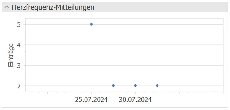
Displayed values:
- High heart rate events
- Low heart rate events
- Irregular heart rhythm events
Section “Cardio-Fitness”
Displayed values:
- Cardio fitness (VO2 max)
- Cardio recovery
- Events for Cardiofitness

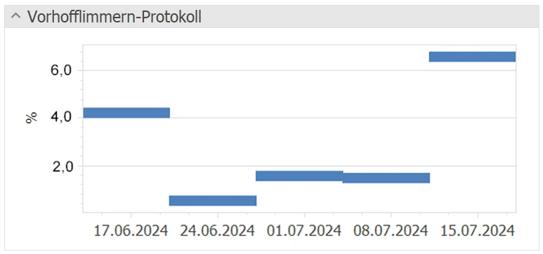
Section “Atrial fibrillation protocol”
The atrial fibrillation protocol is displayed as a Gantt chart.
Please note that in the Apple Health app you have to choose whether you want to record the atrial fibrillation protocol or the irregular heart rhythm events.
Section “Measurement statistics”
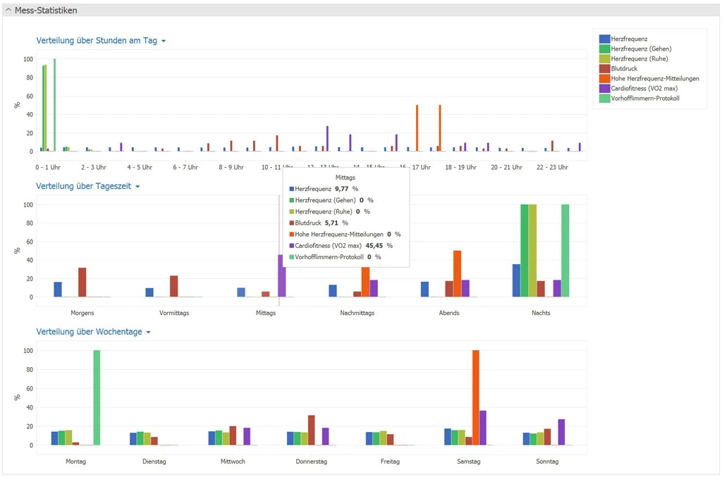
The diagrams for the measurement statistics illustrate the times at which the individual measurements are taken by your devices. This data is not adjusted if the time period is changed, as the relative distribution remains virtually unchanged.
Conclusion
The heart is the center of the circulatory system, supplying all organs with oxygen and nutrients. It is therefore essential to pay particular attention to the heart values.
The evaluation of heart data can provide important insights and knowledge about your state of health. By analyzing this data, trends and patterns can be identified that can help to detect heart problems at an early stage and take preventive measures. Overall, the analysis of heart data offers promising potential for improving heart health.
